

The Best Window Treatment Color for Your Style
Fourteen styles, from coastal to Art Deco, each with its safest colors, its statement options and what to avoid; the rules designers use before any style; and what South Florida sun, light and condo boards decide before you do. Researched across the design press, the mills' published data and our own installs.
There is a best color. It is quieter than you expect.
Clients arrive with a style in mind - coastal, modern, traditional, Palm Beach - and expect each one to come with its own curtain color. The design press, read across more than a hundred articles, designer quotes and fabric-house guides, says something narrower: nearly every style shares one ladder of warm neutrals and differs in the accent, the heading and the metal. The real decisions are the ones nobody asks about first - how far off the wall, which white, which screen color on the glass, and what the building allows toward the street.
What is the best color for window treatments? For almost every style, the best window treatment color is a warm neutral - warm white, ivory, oatmeal, flax, sand or taupe - in a textured fabric such as linen, set one or two steps lighter or darker than the wall rather than matched to it. Your style then decides three things: the accent color, the heading (ripplefold, pinch pleat, Roman, shutter) and the hardware finish. In South Florida the sun decides a fourth: the color of the solar screen on the glass, which is a trade between view, glare and heat that we settle with the mills' published numbers.
Jump to your style:
- Coastal and Hamptons
- Modern and contemporary
- Minimalist, Scandinavian and Japandi
- Mid-century modern
- Industrial and loft
- Organic modern and wabi-sabi
- Traditional and classic
- Transitional
- Mediterranean and Spanish revival
- Art Deco and Miami Modern
- Hollywood Regency and Palm Beach
- Farmhouse, cottage and coastal grandmother
- Boho, eclectic and maximalist
- Tropical and British Colonial
Five rules designers use before they open a fabric book
Every style section below assumes these. They come from the designers quoted in Livingetc, Homes & Gardens, Apartment Therapy and Domino between 2023 and 2026, from the fabric and paint houses, and from our own workroom.
RULE 01
One or two steps off the wall, never a dead match
The most repeated rule in the design press is to stay in the wall's color family and move one or two steps lighter or darker - about one chip up or down on a paint strip. Apartment Therapy calls it the designer rule with a 100% success rate; Livingetc puts it as "a tone or two lighter or darker than the walls, not identical," and Dallas designer Veronica Sanders adds that "tone-on-tone is very much in right now." The warning on both sides is the same: an exact match reads flat (Carlin van Noppen of Fig Linens and Home: "drab and flat"), and a strong contrast is a deliberate decision, reserved for a window that should be the focal point or a room with little other fabric, such as a dining room. Two refinements from Houston designer Marie Flanigan: dark drapery does not shrink a room when the glass is tall and wide, where it anchors the space; and when you go light, do not go much lighter than the wall.
RULE 02
Commit to warm or cool, and never put pure white beside cream
Warm neutrals lean red, orange or yellow; cool neutrals lean blue, green or violet. Hold the fabric against a sheet of plain white printer paper: a peach or yellow cast is warm, a blue or violet cast is cool. Then keep the window in the same family as the wall, the trim and the floor. The rule color consultant Maria Killam states for whites is the one most homes break: white with off-white works, cream with off-white works, but pure white next to cream "usually looks like a failed attempt at coordination." It matters most for sheers, linings and shutters, because a backlit sheer is the largest white surface in the room by day. Greys follow the same logic: choose a grey whose undertone matches the scheme. And blues carry their own trap - some read sterile, and navy turns heavy in a room with little daylight.
RULE 03
Judge it at your own window, three times a day
Light changes the color. Paint maker Little Greene's orientation rules apply to fabric as much as paint: south light is the brightest and warmest, makes neutrals look yellower and often suits slightly cooler choices; north light is flatter and cooler and wants warm undertones; east and west swing through the day. Fabric house Quadrille tells buyers to look at a fabric in morning sun, in the afternoon, under evening lamplight and on a cloudy day, next to the floor, the cabinetry and the rug, and never to decide from a screen. Most South Florida exposures behave like strong south light for most of the day, and white walls with light porcelain floors bounce even more of it onto the fabric, so a cream will warm toward yellow and a showroom mid-tone will read lighter at noon. A fabric with a sheen also throws tinted light back into the room; a matte fabric throws far less.
RULE 04
Keep the field neutral and put the accent in trim, pattern scale and metal
Designers add color without committing a 10 ft wall of fabric to it. Trim is the first tool: in Samuel & Sons' own words, "tonal applications create a more tailored finish, while contrasting trims introduce color," with a leading-edge band of 1 to 3 in and hem bands from 2 in up. Pattern is the second, with a scale rule from designer Elizabeth Rees: never small print on both walls and curtains (dizzying) nor large on both (chaotic); pair one medium with one small, and let a shared color harmonize them. Hardware is the third, and it follows the room's metals rather than the fabric: match the finish of the most prominent hardwired light fixture (designer Jessie D. Miller), keep to two or three metals in the whole house, and remember that black has no temperature, so it pairs with every other metal. For 2026 the design press has bronze and warm brass replacing matte black as the lead finish.
RULE 05
Blackout is the lining, not the color, and the street side is decided for you
A white blackout darkens a room exactly as well as a charcoal one, because the darkness comes from the coated or three-pass lining (white over a black membrane over white), not from the face fabric. That frees the room-side color completely. The outward-facing side is a different matter: where a building has a rule it is usually written as "white as seen from the exterior," with a white liner required on curtains and a white back on shades, and the mills build for it. Lutron's Summer 2026 fabric guide notes that "white backing is the consistent choice, while dark or color-matched backing is gaining popularity." Our default for every building job is a white or off-white street side - white-backed blackout, a two-sided screen with a light exterior face, or an ivory lining - and whatever color the client wants facing the room. The lining choices are in our drapery lining guide.
The best window treatment color, style by style
Fourteen styles. For each: the colors designers name most often, the statement options, the fabric and treatment that carry the look, the hardware finish and what to avoid. Where the guidance comes from the trade rather than from designers, or from our own reading, the card says so.
Coastal and Hamptons
- Safest colors
- Warm white or off-white sheer linen; oatmeal or sand, often in a quiet stripe; light grey or grey-blue; natural or seashell woven wood.
- Statement
- One panel or Roman shade in sky to deep grey-blue; sea-glass green; the Palm Beach version, green and white with a contrast tape.
- Fabric and treatment
- Linen, sheer linen, cotton and woven wood in ripplefold or tailored pleat, with a relaxed or flat Roman on smaller windows; a solar screen on the glass first wherever there is a view.
- Hardware
- Black wrought iron for contrast against the pale palette, or antique bronze.
- Avoid
- Stark optic-white solid panels (designers in Livingetc's 2025 round-up say a solid white panel adds little; use a warm white and make it a sheer), cool grey, goblet and other formal headings, and natural wood blinds right on the salt air.
Our oceanfront jobs on Hillsboro Mile and in Sunny Isles run white: Bright White solar screens at every opening, Limoges White sheers over a 3% screen. White reflects the heat; the trade-off is in the Florida section.
Modern and contemporary
- Safest colors
- Warm white or off-white sheer; greige or warm grey; sand or ecru; white or light grey roller shades.
- Statement
- Charcoal or black drapery; a black-and-ivory pattern against walnut; one color-blocked hue; a charcoal or bronze screen for a water view.
- Fabric and treatment
- Ripplefold or wave fold on a track set at the ceiling - Jessica Davis of Nest Studio (Livingetc) mounts it "as close to the ceiling as possible, and ideally blending with the wall or ceiling color" - plus a roller or solar shade in a cassette matched to the wall, and a sheer layered with a solid.
- Hardware
- Nothing visible: a recessed pocket or a track painted out; black or white track where it shows; bronze rising.
- Avoid
- Cool blue-grey (two designers now call it dated), busy pattern, visible rods and rings, short panels.
In Hallandale Beach we matched a light-filtering roller (Elba Daylight in Limestone) in the living areas to the blackout version of the same fabric in the bedrooms, so one color runs through the apartment at two opacities.
Minimalist, Scandinavian and Japandi
- Safest colors
- Linen matched to the wall paint and set one step off; cream, alabaster, biscuit or oatmeal; a warm light grey only on grey walls; hemp or grassweave woven wood.
- Statement
- Texture rather than hue: a boucle stripe, a slubby linen, a single dark element such as a charcoal stripe or a teak blind.
- Fabric and treatment
- Semi-sheer or slubby linen and wool-blend sheers in wave fold or ripplefold; a flat Roman; a tonal roller; a wide-slat blind that reads as architecture; or no treatment at all where the view and privacy allow. Theresa Obermoser (Livingetc): "Find a linen curtain that matches the paint shade on the surrounding walls."
- Hardware
- A hidden track, no rings; pale wood where a pole shows.
- Avoid
- A generic cool white or grey chosen without reading the wall's undertone, pattern, visible rods, heavy pleats.
Japandi has no separate design literature: treat it as the Scandinavian wall-matched linen rule with the organic palette below (chalk, flax, oat, soft grey) and bamboo or woven wood for texture.
Mid-century modern
- Safest colors
- Oyster or warm off-white linen; sand; natural or slate woven wood; oak or walnut-toned blinds with black tape; a grey-beige.
- Statement
- A mustard or olive panel (olive is the designer-named replacement for navy), a burnt orange or teal Roman, a leaf or restrained geometric print on one roller or Roman.
- Fabric and treatment
- Linen ripplefold with a black border; flat Romans; woven wood; oak blinds; inside mounts that leave the frame showing.
- Hardware
- Black or brass.
- Avoid
- Valances and swags, heavy formal pleating, pattern on every window, anything that costs the room its light.
Designers describe the mid-century palette through the furniture and the walls - walnut, mustard, teal, burnt orange - so the window usually stays neutral and lets the furniture carry the color.
Industrial and loft
- Safest colors
- Charcoal, black, heather grey, undyed linen or canvas, taupe; a crisp white roller against brick.
- Statement
- Denim or indigo drapery; a black solar screen; exposed matte-black metal blinds.
- Fabric and treatment
- Textured linen or canvas rollers; 2 to 2 1/2 in metal or wood blinds for factory windows; panel tracks on the widest openings; drapery with visible texture.
- Hardware
- Matte black steel or iron, pipe-style rods, brushed silver.
- Avoid
- Bright color, florals, satin or shine, decorative finials, swags.
No design magazine has written a window guide for lofts; this is the trade's consensus, and the one point every source shares is raw linen on black iron.
Organic modern and wabi-sabi
- Safest colors
- Warm ivory or chalk; flax and oatmeal; sand and canvas; mushroom to taupe; soft warm grey; natural or hemp woven wood.
- Statement
- Ochre; sage or willow green; clay or terracotta; deep olive; a subtle black border; a soft plaid, gingham or ticking in the same warm neutrals.
- Fabric and treatment
- Loosely woven linen, hemp, gauze and slubbed cotton in a relaxed Roman or on clip rings and hand-tied tabs, with a slight pool at the floor; bamboo and woven wood. Livingetc's palette for the look is "chalk, flax, ochre, and soft grays," and James Gomez of Yarn Collective's rule is to "mix subtle tonal variations rather than stark contrasts."
- Hardware
- Unlacquered or dark wood poles, patinated iron, or a hidden track.
- Avoid
- Stark optic white, cool blue-grey, sheen, crisp formal pleats, velvet, loud pattern.
Shea McGee on her own warm-neutral collection: "when you step back, a lot of these materials have a neutral effect." That is the whole style in one sentence.
Traditional and classic
- Safest colors
- Ivory, off-white or oyster linen; textured taupe, sand or camel; blue-and-white damask, toile, check or stripe.
- Statement
- Emerald or sapphire velvet; paprika or scarlet silk or gingham with a contrast fringe; yellow or fuchsia toile; one toile drenched across walls, curtains and upholstery (Christine Carney of Blackberry Farm Design, in Southern Living).
- Fabric and treatment
- Lined and interlined floor-length panels in a triple pinch or goblet pleat; a cornice, pelmet or valance; a leading-edge band, tape or fringe; a Roman or woven wood underneath.
- Hardware
- Bronze (replacing matte black in 2026), gold or brass, gunmetal, wood poles.
- Avoid
- Heavy drapery that blocks the light, matching Romans on every window ("an overly staged look," designer Jeannine Bogart in Martha Stewart), short or unlined panels, shiny polyester valances. Burgundy and forest green are traditional by reputation; no designer source from the last three years recommends them.
At the Bay Drive mansion in Pompano Beach the master bedroom kept its classic panels and shaped valance in a Kravet Design blue, tan and cream woven check, hung over the room's own motorized blackout in Sesame.
Transitional
- Safest colors
- Cream, ivory or oyster; warm white; beige, tan or sand; flax or oatmeal; taupe or greige; a warm soft grey.
- Statement
- A navy, black or olive stripe; an earthy plaid; dark hardware as the only contrast.
- Fabric and treatment
- Stonewashed or heathered linen in a tailored or inverted pleat or ripplefold; a flat or cascade Roman; a woven wood or solar shade under the drapery; blackout lining in the bedrooms.
- Hardware
- Black or bronze, with bronze leading in 2026.
- Avoid
- Cool light grey, stark white, steel blue, matching Romans on every window.
The designer's schedule we sewed for the Ritz-Carlton Residences, Miami Beach is a transitional palette in one list: Papyrus Sand crinkled sheer, Mirage Fog Belgian linen sheer, Composite Rain linen sheer, Exetor Flax velvet blackout, Spencer Ink and Fitzroy Parchment wool jacquards. Sand to ink, nothing bright.
Mediterranean and Spanish revival
- Safest colors
- Cream, white and oatmeal linen against stucco.
- Statement
- A terracotta or rust panel; a blue or green Roman shade; red linen only on the strength of one precedent (Thomas Callaway pulled Kravet red linen from the cement tile of a 1920s Spanish Colonial).
- Fabric and treatment
- Heavy or gauzy linen; wood-look shutters that echo the beams (composite in our humidity); faux-wood blinds; an arched valance only when the window itself is arched.
- Hardware
- Wrought iron, kept simple. Erin Sander on a 2025 revival in Luxe: "with the floors and beams being so heavy, we wanted to take a softer approach."
- Avoid
- Solid wood in a humid room; heavy ornate ironwork. Ochre and deep blue drapery are asked for often but appear in the sources only as wall and rug colors.
Addison Mizner's Mediterranean Revival is Palm Beach's own vernacular, which is why this palette and the Palm Beach one below meet so often in the same house.
Art Deco and Miami Modern
- Safest colors
- A champagne, black or deep green velvet or silk-look panel with a geometric trim on visible gold or brass hardware.
- Statement
- Emerald, sapphire or burgundy velvet; metallic geometric sheers; gold velvet.
- Fabric and treatment
- Floor-length velvet or silk; sunburst or geometric embroidery; pleated panels; shutters where the building asks for them. Olga Malyev's South of Fifth apartment in Livingetc sets the current Miami reading: bold geometry, "deep burgundy and black," reflective finishes, "old-school Miami glamour."
- Hardware
- Visible gold or brass.
- Avoid
- Glossy minimalism, and the mistake of reading the District's exterior pastels as a drapery palette.
The cotton candy pink, periwinkle, buttercream, mint and seafoam of the Art Deco District are a 1980s exterior paint palette, documented by the National Park Service, not a historic interior scheme; a sheer in buttercream or seafoam is our South Florida translation, not a rule. MiMo leans to Lapidus's deep blue, pale blue and peachy beige, the colors of ocean and sand.
Hollywood Regency and Palm Beach
- Safest colors
- A white or cream ground with pink and green; blue and white; coral; teal and white.
- Statement
- Scarlet silk taffeta, paprika gingham, printed velvet, chintz, jewel-tone birds and palm prints.
- Fabric and treatment
- Tailored or pinch pleat with a contrast tape, brush fringe or ruffled band; scalloped or crenelated valances, cornices and lambrequins; woven wood or matchstick shades underneath. Amanda Lindroth hangs matchstick blinds from the crown molding so tall sliders read taller still.
- Hardware
- Gold, brass, gunmetal; a Greek-key tape on the leading edge.
- Avoid
- Anything timid; heavy blackout where shutters will do; fabrics that cannot take sand and sun (Lindroth specifies performance fabrics at the beach: "Let it scratch").
The Kips Bay Palm Beach show houses are the reference: Paloma Contreras's cream-and-green glazed linen under a crenelated valance, Pennoyer and Engel's paprika gingham with ruby brush fringe, Noz Nozawa's toile panels over sand woven woods in a pink sitting room.
Farmhouse, cottage and coastal grandmother
- Safest colors
- White, cream and flax linen; ticking in flax, soft grey or sand; small gingham in taupe or grey; cream rather than stark white lace; blue and white for the coastal grandmother look.
- Statement
- Faded or small florals; a sunshine yellow in a gloomy room; a navy-and-cream stripe; one large print in a small room.
- Fabric and treatment
- Cafe curtains alone or under a Roman shade (the most-named treatment of 2026); a relaxed Roman; linen panels over woven wood or wood blinds; a gathered pelmet and a soft cottage pleat.
- Hardware
- Black iron or bronze; narrow or French poles.
- Avoid
- Stark white lace, bright or high-contrast gingham, hard flat pelmets, chunky bamboo.
Cafe curtains cover less glass, so Better Homes & Gardens' designers allow them a bolder pattern or color than a full panel would carry.
Boho, eclectic and maximalist
- Safest colors
- Oatmeal sheer linen, a natural relaxed Roman and a sisal-look roller for boho; for a maximalist, a solid shade on every window as the eye's resting point.
- Statement
- Teal or sapphire velvet; a printed velvet ripplefold; shibori, ikat and block prints; shutters in deep green, navy or terracotta (one retailer's idea, worth a mock-up before a commitment).
- Fabric and treatment
- Gauzy sheers, block-printed cotton, velvet; one functional shade plus one decorative curtain per window.
- Hardware
- Whatever the room's dominant metal already is; no source prescribes one.
- Avoid
- Pattern on every layer without a solid base; two small-scale or two large-scale prints together.
When everything is patterned, pick one hero print (Mark D. Sikes: "a good chintz, check, paisley, or stripe is almost always the catalyst"), take its secondary color for the drapery, keep roughly 60% of the room in solids and leave the shade layer solid or textured.
Tropical and British Colonial
- Safest colors
- White or cream cotton and linen panels; natural bamboo, matchstick and woven shades; pale green, pale blue, tan and cream as the secondary palette.
- Statement
- A jewel-tone bird or palm print on one window; sea-green shutters; a blue silk accent.
- Fabric and treatment
- Flowing cotton or linen, often with a trim on the leading edge (Lindroth dresses inexpensive white fabric with edge trim); shutters, composite or vinyl where the humidity decides; matchstick blinds hung from the crown; botanical, paisley and ikat in light cotton.
- Hardware
- Dark wood is the room's metal; shutters painted or natural.
- Avoid
- Heavy blackout in a light bedroom; chunky bamboo; solid wood on a humid wall.
Shutters earned their place here by controlling breezes, storms and heat; the modern version adds a blackout honeycomb behind them where the mornings have to be dark, as we did for a guest house in Boca Raton.
Swatches are illustrative of each palette, not fabric colorways; every color is confirmed with the real fabric at your window.
What the sun, the light and the building decide before you do
Style picks the palette. Here, four other things narrow it: the physics of the screen on the glass, the fiber's resistance to fading, the association's rules and the light itself.
The sun: screen color is a measured trade
On a solar screen the openness (1%, 3%, 5%, 10%) sets how much you see through; the color of the yarn sets what happens to the sun's energy. A white yarn reflects most of it back out through the glass; a charcoal yarn absorbs it and warms. So a dark screen gives the clearest view and the best glare control - the eye focuses on the brighter outdoors, not on the fabric - while a light screen keeps the room cooler and gives more daytime privacy. One weave, three colors, from the mills' published figures:
| E Screen 3% | Daylight in (Tv) | Reflects (Rs) | Absorbs (As) | View-through | Heat gain (SHGC) |
|---|---|---|---|---|---|
| White/White (light) | 13% | 73% | 11% | 17% | 0.28 |
| Pearl/Grey (mid) | 8% | 27% | 63% | 27% | 0.50 |
| Charcoal/Grey (dark) | 5% | 10% | 85% | 42% | 0.60 |
Tv, Rs, As and view-through as published by Lutron for each E Screen colorway; SHGC as published by Mermet USA for an interior shade behind residential glass. Retrieved September 2026. Openness, not color, sets the UV protection (about 97% at 3%, 99% at 1%). The 1%, 5% and 10% weaves and the Phifer SheerWeave colors follow the same pattern: see the openness guide and dark or light solar shade fabric.
Read the table from the dark end: as the color lightens, reflectance climbs from 10% to 73% and the heat gain coefficient roughly halves, while the view rating falls from 42% to 17%. That is the whole trade. Most new South Florida towers have tinted or laminated impact glass, which narrows the heat penalty of a dark screen without removing it. Where you want both, specify a two-sided fabric (a dark face to the room, a light face to the glass) or a dual roller with a light blackout behind the dark screen.
Fading: the fiber decides more than the color
No color is immune to South Florida sun; what you can control is the fiber, the dye and the lining. Silk is the most light-sensitive fiber and belongs in lined and interlined panels off the direct glass; rayon and unlined cotton or linen follow; polyester holds well; solution-dyed fibers, with the pigment inside the yarn, hold best. The evidence on color splits two ways and both are true: saturated reds and dark blues degrade faster chemically, while pale colors show a visible shift sooner. Ask for the lightfastness grade: on the blue-wool scale (ISO 105-B02) fabric houses recommend grade 5 for most rooms and 6 or higher for south- and west-facing glass; the US contract floor (AATCC 16) is grade 4 at 60 hours. A reflective lining does more than any fabric choice, and a woven screen in front of drapery blocks about 90% to 99% of UV depending on openness, which is why the layered window in our best window covering solution protects whatever color you choose. Fiber by fiber: curtain fabric types.
The building: white toward the street
Association rules across the country use the same template language, "all window treatments shall be white as seen from the exterior," and South Florida boards enforce it like any other exterior rule. Check your building's documents before you fall for a dark-backed shade. The compliant route is a white or off-white street side and any color you like facing the room: a white-backed blackout, a two-sided screen such as Charcoal/Grey or Charcoal/Alpaca with the light face out, or an ivory lining behind the drapery. More on the building rules in window treatments for condos.
The light: approve the color at noon and again at night
South Florida light is bright, warm and constant, and a white room with a light floor reflects it onto the fabric from below. A color that looked neutral in a showroom turns yellow, green or harshly white at the window. Our practice: bring the real fabric, not a chip, to the actual window; look at it at midday and again under the evening lights; when in doubt lean one step warmer or one step greyer, never cooler; and remember that a sheer or a white screen becomes the brightest surface in the room by day, which is the reason the dark-screen advice matters more here than in a cloudier market. You can preview a fabric on a photo of your own window with our window visualizer and identify a fabric you have seen with the fabric finder.
Room by room
| The room | What decides the color here |
|---|---|
| Bedroom | Any room-side color on a white-backed blackout; ivory, sand and muted grey are the usual Florida choices, a dark face where the room should feel like a theater. On a sunrise-facing bedroom the blackout is not optional. See bedroom window treatments. |
| Living room with a water view | A charcoal, bronze or black screen for the view and the glare, with a sheer or lined drapery in front for the evening, when a dark screen lets the lights inside show out. A two-sided screen if the building wants white toward the street. |
| West-facing glass | The lowest openness (1% to 3%) and the color decided by what the room is for - light for heat, dark for view - on a motor scheduled for the afternoon. Check any fabric here at 3 p.m. |
| Home office | A 1% to 3% dark screen on the window behind the monitor rather than a light sheer, which becomes a bright surface behind the screen. See media room treatments for the fully dark version. |
| Kitchen and bath | Composite shutters or faux-wood blinds in white or the trim color, or a washable roller; nothing unlined next to steam or the stove. |
| Rooms with art | A 1% screen and a secondary blackout shade, which is what Lutron's own guide pairs for the greatest UV protection. |
What is in, what is out, and what is next
The style guide above is built to outlast a trend cycle. This is where the cycle stands as of October 2026, with the sources.
The color authorities agree: warm, earthy, textured
Pantone's 2026 Color of the Year, announced on December 4, 2025, is Cloud Dancer (11-4201), its first white, and the Pantone Color Institute was careful to say it is not a stark one - a brighter white "speaks to sterility." It follows 2025's Mocha Mousse, the first brown. Every 2026 paint color of the year sits in the same warm, earthy range: Sherwin-Williams Universal Khaki (SW 6150), Benjamin Moore Silhouette (AF-655), Behr Hidden Gem, Valspar Warm Eucalyptus, PPG Secret Safari and Dunn-Edwards Midnight Garden - khaki, a deep brown-charcoal and four greens. For the window, that reads as warm textured whites, oatmeal and flax on khaki and ivory walls, and light warm sheers or chocolate, moss and oxblood velvet against the deep greens and browns.
What the data says is rising and falling
Houzz's US search data for January to March 2026 against the year before: rust up 178%, chocolate brown up 153%, mushroom up 69%, sage up 55%, taupe up 50%, cream up 44%, with no grey on the list. In 1stDibs' 2026 designer survey chocolate brown was the most cited color at 33%, cornflower blue 31% and burgundy 21%, while white, slate grey and black fell into single digits. The design press is consistent on what reads dated: cool and steely grey, stark optic white and flat beige. What reads current: taupe, camel, chocolate, olive, terracotta and warm textured whites, with stripes, trims and cafe curtains back on the window and bronze or warm brass replacing matte black on the rod.
Already on the horizon
The 2027 colors of the year that had been announced by September 2026 swing lighter and greener: Sherwin-Williams Celery, Behr Grounded (a mossy olive) and Valspar Cottage Door (a powder blue). So espresso and chocolate are current, fresh greens and powder blue are next, and a warm neutral window sits comfortably under both. The full list, with the treatments behind it, is in our 12 window treatment trends for 2026.
Colors we have installed, with the fabric named
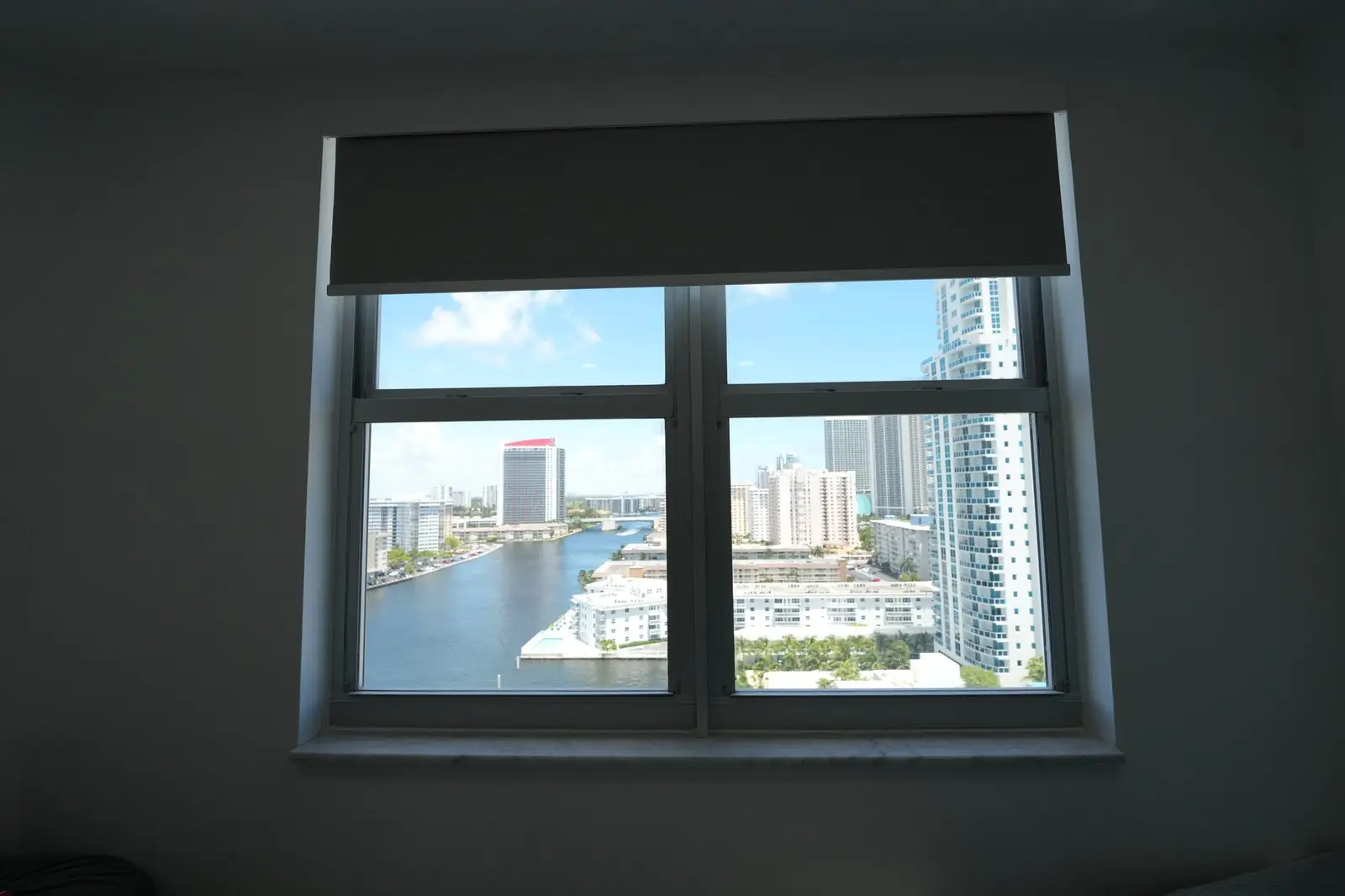
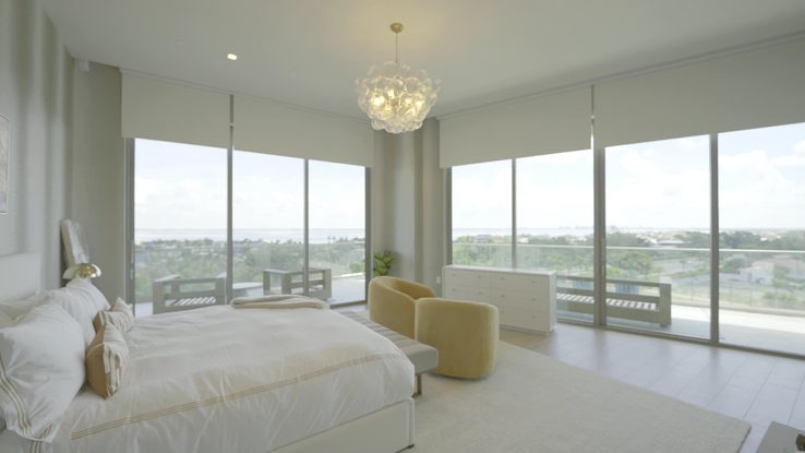
Six South Florida and Gulf Coast jobs, each a different style decision about color. More in the project gallery.
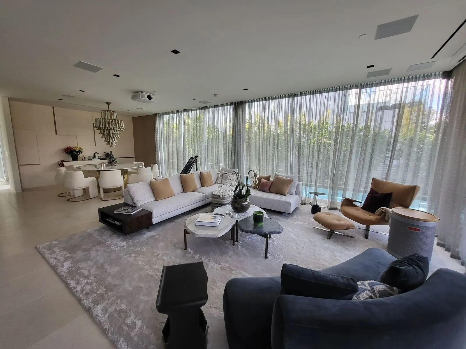
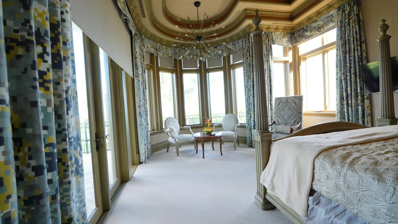
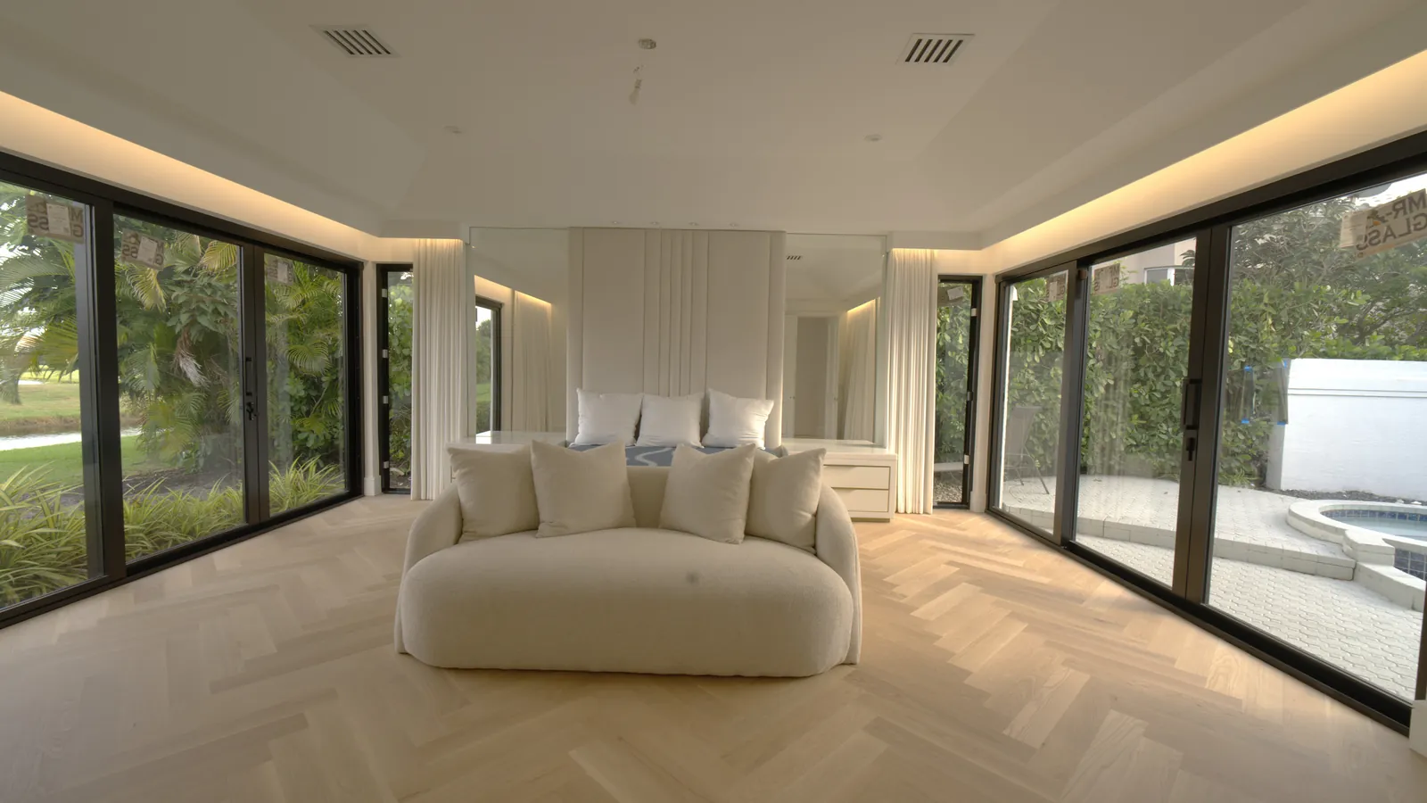
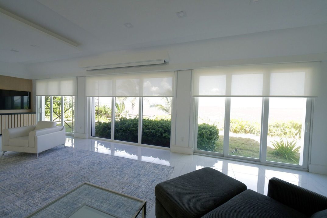
How we choose a color with you
One free hour
A consultation in your home. One free hour with our team routinely saves owners thousands in avoidable mistakes.
Read the room first
The wall's undertone, the floor, the rug, the metals already in the room and the direction the glass faces. The color family is usually decided before a fabric book opens.
The books at your window
We bring the fabric books from our libraries and hold the real fabric at the real glass, at midday if we can, and look at it again under the evening lights before anything is ordered.
Numbers for the screen
Openness, visible light, reflectance and heat gain from the mills' published tables, matched to what the room is for: view, heat, glare or sleep.
Lining and street side
White or off-white toward the street, the lining chosen for the fabric and the exposure, blackout where you sleep, and the building's rules checked before anything is ordered.
Made and installed by us
Draperies sewn by our five in-house seamstresses in Fort Lauderdale; shades fabricated to the measure; installed and programmed by the team that measured, typically 3 to 4 weeks after.
Window treatment colors, frequently asked
What is the best color for window treatments?
A warm neutral - warm white, ivory, oatmeal, flax, sand or taupe - in a textured fabric, set one or two steps lighter or darker than the wall rather than matched to it. It is the one answer the design press repeats for every style; the style then decides the accent color, the heading and the hardware finish, and in South Florida the sun decides the color of the solar screen. The style-by-style guide is on this page.
Should curtains be lighter or darker than the walls?
Either, as long as they are not identical: one or two steps off the wall, about one chip on a paint strip. Go lighter to keep a room airy and the window quiet; go darker to anchor tall, wide glass or to zone a dining area. Designers warn against two extremes: a dead match reads flat, and heavy dark panels on a small window in a small room shrink it.
What color curtains go with white walls?
Warm white, ivory, oatmeal or flax one step warmer or deeper than the wall, in linen or a linen blend, with black iron or bronze hardware if you want the window to read. Read the white first: a cool bright white wall takes a cool white sheer; a creamy white wall takes ivory or oatmeal. The combination to avoid is pure white fabric beside a cream wall or cream trim.
What color window treatments go with grey walls?
A grey with the same undertone as the wall, one step darker, or a warm white or greige if the grey is cool and you want to warm the room. Check the undertone against white paper: a grey that leans blue or green is cool, one that leans brown or red is warm. Cool steely grey is the one color the 2026 design press calls dated, so if the walls will be repainted, plan the window for what comes next.
Are grey and white window treatments out of style?
Cool grey, stark optic white and flat beige are the three the design press has called dated since 2025, and the 1stDibs 2026 designer survey has white, slate grey and black in single digits. Warm whites, oatmeal, taupe, camel, chocolate, olive and terracotta read current. Choose for the house rather than the year, but if the choice is between a cool grey and a warm one, take the warm one.
What is the best color for roller shades and solar shades in Florida?
It depends on what the room is for. A white or light screen reflects the most heat and gives the most daytime privacy; a charcoal, bronze or black screen gives the clearest view and the best glare control. On the same 3% weave, White/White reflects 73% of the sun's energy with a 17% view-through rating, Charcoal/Grey reflects 10% with 42% view-through. For a blackout or light-filtering roller the color is free: match the wall, the trim or the drapery, and keep the back white toward the street.
Dark or light solar shades for an ocean view?
Dark for the view - charcoal, bronze or black, usually at 3% openness, 1% on the harshest west glass - unless the room's first problem is heat, which is why one oceanfront house of ours runs Bright White at every opening. The glare off the water bounces up from below, and a light screen glows while a dark one keeps the view readable. Two things to plan for: the dark screen admits more heat, which the glass and the air conditioning absorb, and it is see-through at night once the lights are on, so pair it with a sheer or drapery, a blackout layer or a two-sided fabric. The numbers are in dark or light solar shade fabric.
What color should blackout shades or curtains be in a bedroom?
Any color you like on the room side, because the darkness comes from the lining or the coating, not the face. Ivory, sand and muted grey are the usual South Florida choices; a dark face gives a bedroom or media room a theater quality. Keep the back white or off-white toward the street, and in a condo check the rules first.
Which colors fade fastest in the Florida sun?
The fiber matters more than the color: silk fades first, then rayon and unlined cotton or linen; polyester holds well and solution-dyed fibers best. Among colors, saturated reds and dark blues degrade faster, while pale colors show a visible change sooner. The practical answers are a lining or interlining on every panel, a woven screen in front of the drapery on sun-facing glass, and a fabric graded 6 or higher on the blue-wool scale for south and west exposures.
Can I have colored curtains in a condo?
Facing the room, yes. Facing the street, many associations require white or off-white, written as "white as seen from the exterior." A white lining on the drapery, a white-backed blackout or a two-sided screen with the light face out satisfies the rule and leaves the room-side color to you. Read your building's documents before ordering anything dark-backed.
What color should sheers be: white, ivory or linen?
Take the white from the room's wall and trim family, because by day a backlit sheer is the largest white surface in the room. A cool bright white on cool white walls; ivory or warm white on creamy walls; oatmeal or flax in a room with a lot of wood or a warm floor. A sheer with a visible weave or a stripe reads richer than a flat white voile, and designers in 2026 treat the sheer as a layer in its own right rather than a filler.
Should drapery hardware match the fabric color?
No. Hardware follows the room's metals: match the finish of the most prominent hardwired light fixture, keep to two or three metals in the house, and use black where you want a finish with no warm or cool bias. Bronze and warm brass are the 2026 lead, matte black the finish being replaced. A ceiling track in white or black, or a recessed pocket, is the modern way to have no visible finish at all - see drapery hardware.
What colors are trending for window treatments in 2026?
Warm textured whites, oatmeal and flax; taupe, camel and chocolate; olive and deep green; terracotta and rust; burgundy as an accent or trim; stripes and cafe curtains; bronze and brass hardware. Pantone's 2026 color is a soft white, Cloud Dancer; every 2026 paint color of the year is a warm khaki, brown or green. Cool grey, stark white and flat beige are the colors being left behind.
How do I choose a color for a Palm Beach or Miami Art Deco home?
Palm Beach is bold color on a white or cream ground - pink and green, blue and white, coral, teal - with trim, valances and a woven wood underneath. Art Deco interiors are velvet and silk in champagne, black, emerald, sapphire or burgundy with geometric trim on brass; the District's pastels are an exterior paint palette, so use them lightly, as a sheer, if at all. Both styles are on this page, with the sources.
Do you bring fabric samples to the consultation?
Yes. We bring the fabric libraries to your home and hold the real fabric at your window, in your light, and you can request samples of specific fabrics from our libraries. You can also preview a fabric on a photo of your own window with the window visualizer.
Sources behind this guide
- Apartment Therapy, Matching curtains to wall color (May 2024)
- Livingetc, Should curtains match your wall color?
- Livingetc, Should curtains be lighter or darker than walls?
- Homes & Gardens, Curtain color mistakes (Feb 2023)
- Homes & Gardens, How to choose curtain colors for any room
- Maria Killam, Combining whites and creams
- Little Greene, Considering the orientation of a space
- Quadrille, Why fabric samples matter
- Samuel & Sons, Drapery education guide (PDF)
- St. Louis Magazine, choosing a drapery hardware finish (Jessie D. Miller)
- Livingetc, Bedroom curtain trends 2026 (Nest Studio)
- Livingetc, Scandi-inspired window treatments (via inkl)
- Livingetc, Wabi-sabi curtains
- Livingetc, Curtain colors going out of style (Jun 2025)
- Martha Stewart Living, Outdated window treatments (Oct 2025)
- Better Homes & Gardens, 7 window treatment trends designers are choosing
- Southern Living, Designers on toile (Dec 2024)
- Luxe Interiors + Design, Erin Sander's Spanish Colonial Revival (2025)
- Livingetc, Olga Malyev's Miami home tour
- National Park Service, Color palettes saving buildings from demolition (Miami Beach Art Deco District)
- Chairish, Kips Bay Palm Beach 2022 window treatments
- Southern Home, Amanda Lindroth at the beach
- The Expert, Mark D. Sikes's decorating tips
- Lutron, Quick Fabric Reference Guide, Summer 2026 (PDF)
- Phifer, SheerWeave 2500/2410/2390/2360 sample card with solar optical data (PDF)
- Draper, Using performance measurements to choose a shade fabric
- Kothea, Lightfastness grades for curtain fabrics (ISO 105-B02)
- James Dunlop Textiles, Increasing the lifespan of textiles
- Smithsonian Magazine, Pantone's 2026 Color of the Year, Cloud Dancer (Dec 2025)
- American Coatings Association, Industry colors of the year 2026
- Homes & Gardens, Colors of the year 2027
- Houzz, 2026 U.S. Houzz Emerging Summer Trends Report
- 1stDibs, Interior design trends 2026 (designer survey)
Discerning homeowners, designers, and developers across South Florida trust Exotic with their most important spaces.
“Very happy with my new pinch pleat drapes! Exotic Shades & Draperies came to my condo in Fort Lauderdale with many fabric options and a variety of material. I wasn’t sure what to choose, but they gave me great guidance on the fabric and style. The result is perfect more privacy while still keeping plenty of natural light. Highly recommended !”
“Exotic Shades and Draperies made is to easy for me to change up my bedroom design for a new aesthetic i’ve been really wanting. They helped me choose a new look for my curtains and installed them very quickly. Thank you david for helping me throughout the process. i highly recommend if u want high quality drapes or shades”
“The experience with Exotic Shades Draperies was excellent. The shades are high quality and custom fit. They are really careful with details. We bought sheer curtains and they offered us a better price than all the other companies we contacted, and their work was flawless. It was a pleasure working with Dave and Alex.”
Exotic Shades & Draperies, Fort Lauderdale and Miami Beach
Exotic Shades & Draperies is a South Florida window-treatment company that designs, sews and installs its own work: Lutron and Somfy motorized shades, custom draperies sewn in our Fort Lauderdale workroom by five in-house seamstresses, plantation shutters and blinds. Established in South Florida in 2024, backed by more than 20 years of window-treatment manufacturing and installation experience. Lutron certified dealer, Somfy Expert, Crestron and Control4 integration. The same in-house team measures, installs and programs every project; when shading has to integrate with another control system, we bring in our smart-home partner Adom Smart Home.
Fort Lauderdale workroom and showroom
4539 Powerline Rd, Fort Lauderdale, FL 33309 · 954-881-9331
Miami Beach showroom
500 South Pointe Dr #150, Miami Beach, FL 33139 · 954-872-9007
Where we install
Miami-Dade, Broward and Palm Beach counties: Miami Beach, Sunny Isles and Aventura through Hollywood, Fort Lauderdale and Pompano Beach to Boca Raton, Delray Beach and West Palm Beach, with projects in the Caribbean and New York.
How a project runs
Free in-home measurement, a written quote from the same engine as our published prices, fabrication in our own workroom, installation and programming by our own team, and service on the systems we install.
Color consultations in Fort Lauderdale, Miami, Boca Raton & Palm Beach
Draperies, sheers, shades, shutters and the fabric libraries to choose them from, across Miami-Dade, Broward and Palm Beach County - from Miami Beach, Brickell and Sunny Isles through Hollywood and Fort Lauderdale to Boca Raton, Delray Beach and West Palm Beach - sewn in our own workroom at 4539 Powerline Rd in Fort Lauderdale and installed by our own team. Our second showroom is South of Fifth in Miami Beach.
The right color is decided at your window, not in a showroom
One free hour with our team routinely saves owners thousands in avoidable mistakes. Book a private, complimentary consultation - the fabric libraries at your glass, in your light, with the numbers for the screen and the rules of your building already checked.